
Need testing and feedback on the 2.x branch of Opera. This is a MAJOR rewrite with new features and will not be backward compatible. Best when tested with https://github.com/stpaultim/design_tokens. The Design Tokens module is a possible alternative to the color module. Need feedback on this idea.
Opera is a Backdrop CMS theme designed for sites that use stacked, full-width panels on the front page with alternating background colors. It is approachable for people new to Backdrop and offers significant customization through the admin UI — no CSS required.
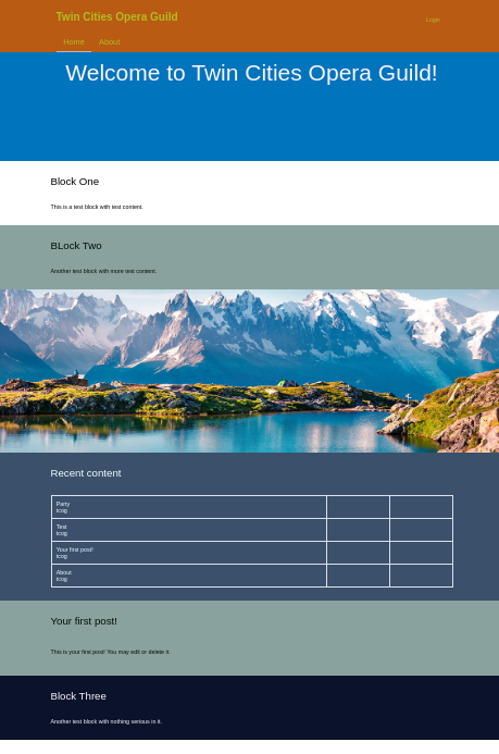

Opera 2.x is under active development. The theme is functional and suitable for testing, feedback, and building on. Not recommended for production sites until a stable release is tagged. Bug reports, feature requests, and pull requests are welcome.
Opera is a good fit if you want to:
- Build a front page with full-width stacked content panels in different background colors
- Customize colors, fonts, buttons, and links through the admin UI without writing CSS
- Use a theme that works well out of the box for a non-profit, arts organization, or community site
The signature Opera layout uses Backdrop's Boxton layout on the front page. Blocks in the content region extend the full width of the screen with their own background colors. The first block is always white; subsequent blocks cycle through your chosen color sets.
Opera uses a two-bar header: a logo bar above (white by default) and a nav bar below (your primary brand color). Each bar has independent color controls so the nav bar can match the footer while the logo area stays neutral. Both colors are Design Token–controlled.
The header supports two logo modes, configured under Appearance > Settings > Opera:
- Image — upload a logo via the standard site settings
- Phosphor icon — choose any icon from Backdrop's built-in Phosphor icon set by name. The icon automatically inherits your header text color, so it adapts when you change your color scheme. A live preview updates as you type the icon name.
A Logo size setting (Small / Medium / Large / X-Large) controls the maximum height of the logo in the header bar, accommodating everything from compact icon marks to wide illustrated wordmarks.
Top-level navigation links are displayed in white semi-bold text against the primary color bar for strong readability. Interactive feedback includes:
- A sliding accent bar that animates in on hover (color controlled by the Secondary / Accent token, independent of link colors)
- A lighter background highlight on hovered items
- Consistent semi-bold weight and white text in dropdown sub-menus
Opera uses the Design Tokens module to manage all visual configuration. From a single admin page you can change:
- Header / Logo Bar — background and text color for the logo bar
- Navigation & Footer (Primary Colors) — background, text, and link colors for the nav bar and footer
- Secondary / Accent Color — the highlight bar color used on nav menu hover states, independent of link colors
- Buttons — background, text, hover, border radius, and text transform
- Links — color, hover color, visited color, and underline behavior
- Typography — heading and body font families, with Google Fonts support built in
- Hero Blocks — colors for hero blocks without a custom image
- Cards & Teasers — card background color and corner radius
- Block Color Sets — up to 8 background colors for cycling front-page blocks. Text and link colors are calculated automatically based on whether the background is light or dark.
Changes are reflected in a live preview alongside the form — no page reload required.
Opera ships with four preset color schemes: Opera (deep red and gold), Plume (navy and teal), Bright (vivid primaries), and Night (dark mode feel). Applying a scheme populates all color fields at once. Modifying any value after applying a scheme marks it as Custom.
The Design Tokens admin page shows WCAG contrast ratio badges next to each text color field, updated in real time as colors change. Text and link colors for colored blocks are auto-calculated using the WCAG luminance threshold so they always meet AA contrast requirements against their background.
- Backdrop CMS 1.x
The Design Tokens module and its
design_tokens_color and design_tokens_font sub-modules are strongly recommended. Opera
works without them using its built-in default styles, but full color and font customization
requires Design Tokens.
- Set Opera as your default theme at Appearance.
- Install and enable the Design Tokens module and its
design_tokens_coloranddesign_tokens_fontsub-modules at Functionality > Modules. - Configure your site's appearance at Appearance > Design Tokens > Opera.
- Set your front page to use the Boxton layout at Structure > Layouts.
- Add blocks to the Boxton layout's content region — they will automatically receive cycling background colors.
The Opera theme settings page (Appearance > Settings > Opera) includes a list of modules that pair well with Opera, with direct links to install them. These include:
- Configurable Block Styles — apply style presets to individual blocks
- Nice Messages — improved styling for status and error messages
- Tab Icons — icons on admin task tabs
- Custom Breadcrumbs — control over the breadcrumb trail
Opera overrides several of Backdrop core's layout templates to improve behavior for typical use cases. The most significant change from core is collapsible sidebar regions.
In core layout templates, sidebar regions are always rendered even when empty, which reserves column space and narrows the main content area unnecessarily. Opera's templates for all sidebar layouts (Moscone, Moscone Flipped, Taylor, Taylor Flipped, Harris, and Simmons) check whether each sidebar region contains content before rendering it. When a sidebar is empty, the main content area expands to fill the full available width. In two-sidebar layouts, each sidebar collapses independently, so a layout with only one populated sidebar renders as a two-column layout rather than three.
This behavior is implemented entirely in the layout templates and requires no CSS changes or configuration.
The Boxton layout has a second Opera-specific template variant, layout--boxton--front.tpl.php,
used on the front page. In this variant, .l-wrapper-inner does not carry Bootstrap's
container container-fluid classes, so blocks in the content region are free to stretch
to the full viewport width. Each block is responsible for constraining its own inner
content via the block--inner-wrapper container div in block.tpl.php. The top region
is also moved outside .l-wrapper-inner so it too can extend edge to edge. On interior
pages the standard Boxton template is used, where .l-wrapper-inner applies the
container constraint as usual.
- First content block: always white background, standard link colors
- Subsequent content blocks: cycle through your configured color sets (2–8 sets, configurable in theme settings)
- Color sequencing is controlled by the Color sequence length setting
Each color set is defined by a single background color. Text and link colors are automatically computed from the background's luminance — dark backgrounds get light text and light links; light backgrounds get dark text and standard body link colors.
Blocks using the Hero block type display with a minimum height of 450px. The hero region uses its own color set separate from the cycling block colors.
Opera automatically styles tag pill badges for two cases:
- Taxonomy term reference fields — any
field-type-taxonomy-term-referencefield displayed on a node renders its term links as pill badges. - The built-in Tags view — the
view-tagsblock (Backdrop's default Tags view) is reflowed into a matching flex pill group.
If you create a custom Views block that lists taxonomy terms or other tag-like links and
want the same pill treatment, add the CSS class tag-list to the view display:
- Open the view in the Views UI
- Under Advanced → CSS class, enter
tag-list - Save the view
Opera will then apply the pill badge styles to that view's output automatically.
Opera is suitable as a base for a sub-theme. A sub-theme can:
- Override any template in
templates/ - Add its own
tokens.incto extend or replace Opera's Design Token definitions - Override CSS in component files under
css/component/
The Opera theme is maintained at https://github.com/backdrop-contrib/opera.
This theme was developed with significant assistance from AI tools (specifically Claude by Anthropic). AI was used to generate code, plan features, and make iterative improvements throughout development. We welcome feedback.
Pull requests and issue reports are welcome.
This project is GPL v2 software. See the LICENSE.txt file in this directory for complete text.
- Tim Erickson (https://github.com/stpaultim/)
Development supported by Simplo (by Triplo) - https://simplo.site